YYprofdev
Sunday, 22 April 2012
Dummy design 2
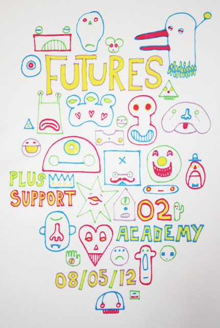
Another dummy design based on the May 8th event at the O2 Academy. This design uses only three colours, and I'm going to propose to my collaborator that it might make a good screen print that could perhaps be sold as merchandise at the show. I am hopeful that he'll respond positively to this suggestion as I have been keen to produce more screen-printed work. As a piece of design I feel it adequately matches the brief of being "pop,' 'fresh' and 'positive.'
Dummy design 1
This is a dummy design I have produced as a possible final outcome. The final dates and roster have yet to be confirmed, so the information I have used is for another concert my collaborator has some involvement with. I think the bold colours and simple shapes could quite readily be applied across a range of media, and the inherent design is versatile enough that it can work with nearly any set of information once I'm provided with it.
Preparatory designs
Further sketches
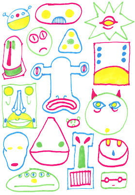
Further experiments with a more commercial, upbeat style of illustration. While none of these images will neccesarily suit a final outcome, I have enjoyed using a more varied palette and think the experience I've gained in their production will transfer in some way to the final design. I want the final image to have a slight edge to it that will make it interesting as well as bright and upbeat, which is a way of producing artwork that I am still practising for the final product.
Student project
One of the Graphics students asked me for a contribution to his zine, this is the image I produced. The image had to be single-colour and had to read at A5 scale. The concept was to draw a childhood character from memory. I drew Count Duckula terrorising Robert Pattinson in mixed media, watercolour and ink. I think it made it into the final version of the zine. The image is a bit of fun and hopefully not too offensive.
I have asked my contact in LIPA for three key phrases that might describe the acts he represents, and also what style of artwork might suit the bands, and he responded with "pop," "fresh" and "positive." Producing light, saleable artwork has been something I've struggled with in the past, but these are some sketches I produced in response to the briefing.
I'm using bold colours and simple forms with the idea that these designs will be most easily transferrable to a final design, and could work across a range of media. The sketches have been fun to produce, once I got a handle on how to produce friendly, 'pop'-oriented work.
Subscribe to:
Comments (Atom)


